us airways Typographic Design Airline RE brand
This airline rebrand, developed in my Typographic Design course, strengthened my ability to build a cohesive brand identity through an iterative, feedback-driven process.
I refined my logo design skills while advancing my proficiency in Adobe Illustrator, resulting in a clear and compelling visual system.

US Airways Airplane Mockup

Logo Process
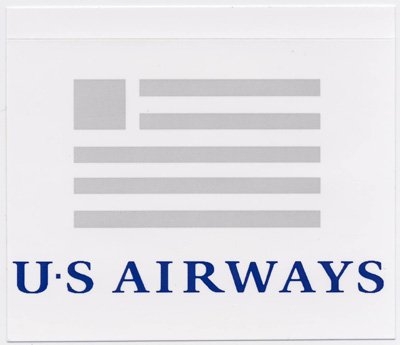
Original Logo for US Airways

Primary Logo
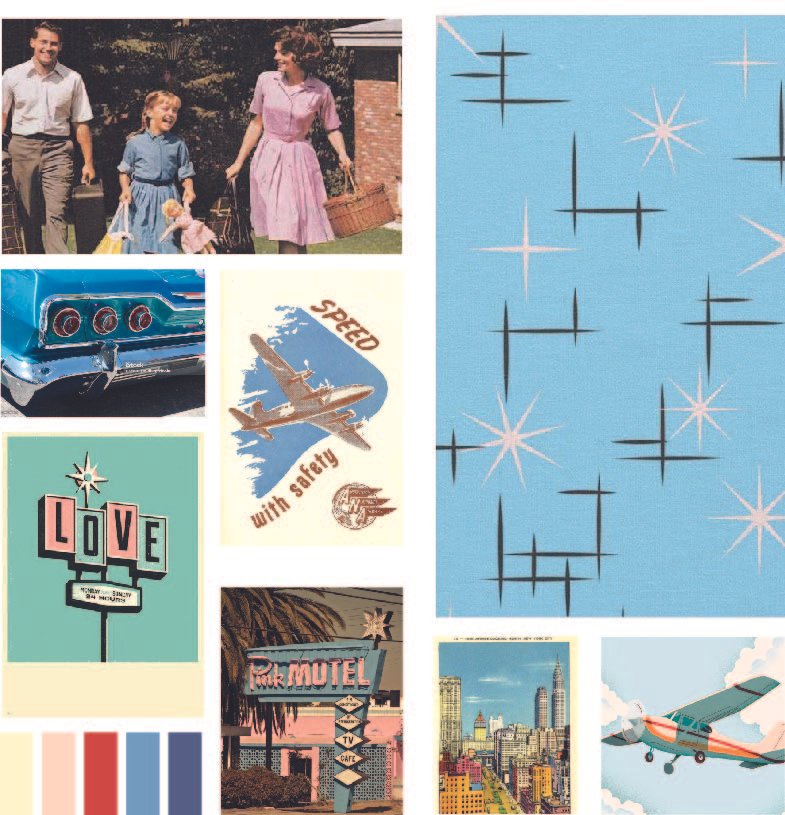
Mood Board
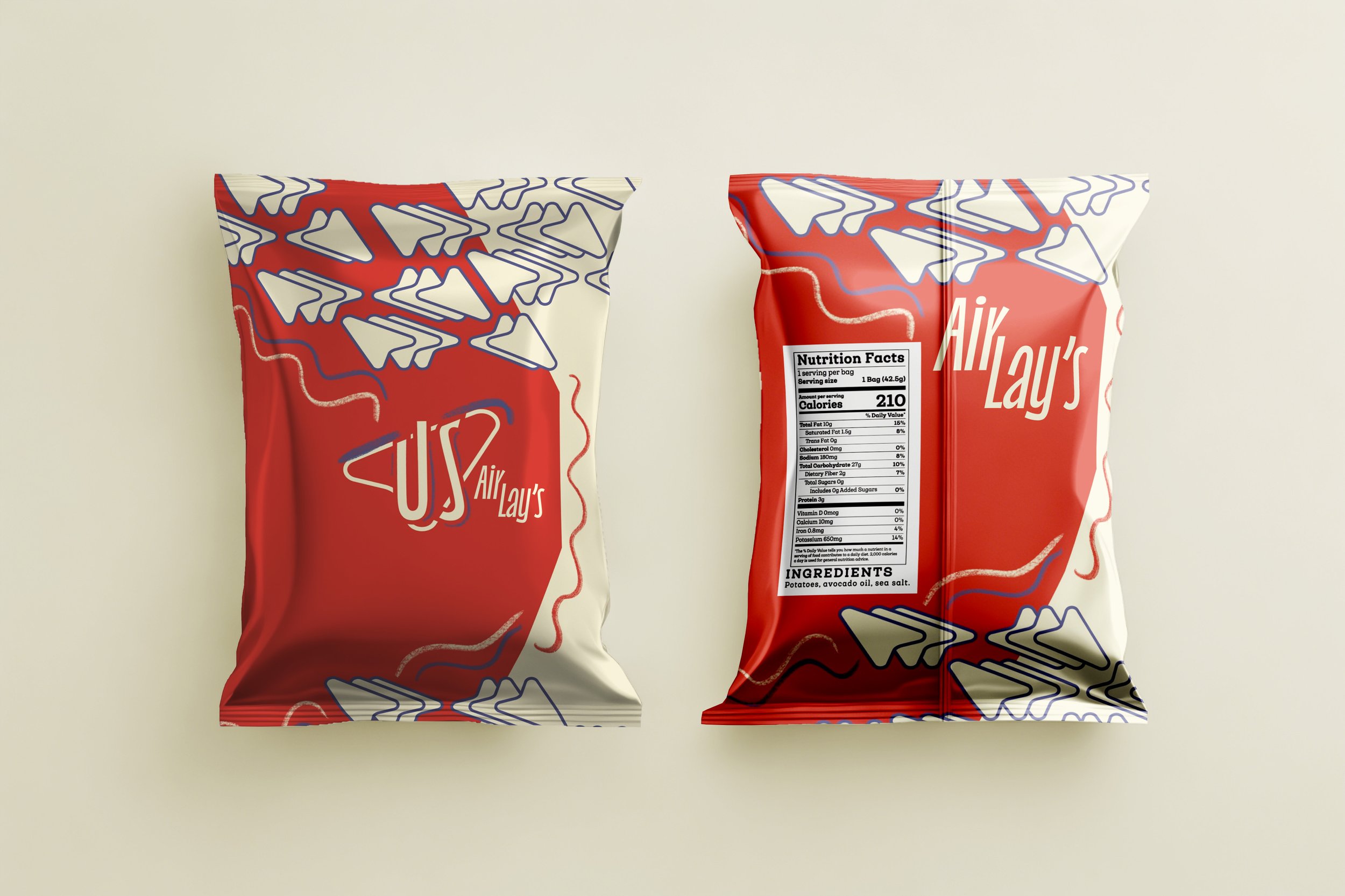
Promotional Product

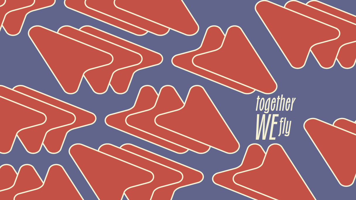
Promotional Billboard

Promotional Product
Who is US Airways?
US Airways evolved from a small Pittsburgh mail carrier into a trusted, all American airline. Today, it focuses on reliability and a seamless, customer centered experience to build lasting traveler loyalty.
WHat is the brand’s ethos?
US Airways reflects the Everyman archetype, emphasizing a welcoming, at-home experience for every passenger. Its friendly palette and upward arrow mark symbolize growth and unity, while the rebrand shifts the tone to feel more approachable and inviting.
Reflection
This project strengthened my ability to translate feedback into clear, intentional design decisions while staying true to my vision. I learned to balance outside input with strong personal direction, resulting in work that is both thoughtful and confidently executed.